

### Blog Post:
Color drenching is rapidly gaining traction as a bold way to elevate any interior, but getting polished results—without frustration or regret—demands more than simply painting every surface the same shade. In this guide, you’ll discover how to move beyond DIY pitfalls and achieve a sophisticated, monochromatic look that works for your real space.
Key Takeaways
- Color drenching means painting walls, ceilings, trim, and even radiators or furniture the same color—or subtle variants—to create an immersive effect.
- Lighting, room size, and finish selection are critical for success; skipping pre-testing almost guarantees disappointment.
- Smart tweaks like mixing finishes, layering textures, and strategic tone-on-tone accents prevent the dreaded “boxy” or overwhelming vibe.
- What is Color Drenching and Why is it Trending?
- Is Color Drenching Right For My Space?
- Most Common Color Drenching Mistakes & Homeowner Regrets
- Expert-Level Techniques for a Polished, Livable Look
- Before You Begin: Testing and Prepping for a Flawless Color Drench Room
- Inspiration Gallery & Pro Tips for Every Room
- FAQs
What is Color Drenching and Why is it Trending?
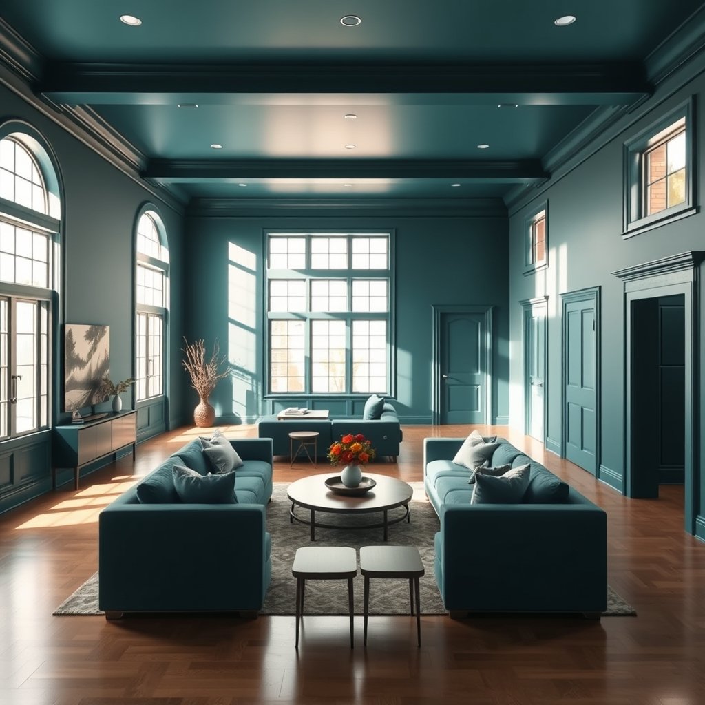
Color drenching is the process of painting nearly all surfaces in a room—walls, ceilings, moldings, even window frames—the same color or close tonal variations to achieve a unified, monochromatic environment. Unlike an accent wall or a pop of bold color, a color drenched space immerses you fully in the chosen hue, blurring edges and making boundaries disappear.
Why is color drenching one of the most exciting bold home decor ideas of the year? This technique delivers maximum impact and a truly custom feel. It’s fresh for 2024 and beyond, especially as homeowners shift away from white walls and neutral schemes in favor of richer, more expressive color moments. Whether you’re after a cozy, moody den or a vibrant creative studio, paint color drenching increases drama and cohesion while allowing details and textures to subtly come forward.
Is Color Drenching Right For My Space?
Before you grab a roller, consider the architecture and lighting of your room. Color drenching works differently in each setting. About 68% of interior designers recommend homeowners start with a small color drench room such as a powder bath, study, or guest bedroom. These environments give you the drama of the trend without feeling overexposed if you don’t love the result. For large rooms, only 45% of designers recommend the approach, usually if you want to add a sense of intimacy or highlight existing moldings and built-ins.[1]
When evaluating whether paint color drenching is right for your space, ask:
- What natural and artificial light does the room receive through the day? Colors shift much more than you think.
- Are you working with unusual architectural details, like arched doorways or detailed crown molding, that could be enhanced (or lost) with monochrome coverage?
- Is the overall mood you want immersive and enveloping—or would that feel too intense long-term?
If you crave a room that feels visually larger, this trend may not be the ideal fit. Consider starting with a color drenched nook or accent, then scale up once you’re confident.
Most Common Color Drenching Mistakes & Homeowner Regrets
Color drench decor can look museum-level beautiful—if you sidestep some persistent, under-discussed missteps. Real feedback from homeowners shows:
- “Cave effect” after dark: What felt cozy at noon becomes gloomy at night, especially if the color is rich but lighting remains unadjusted. This can shrink the perceived room size and kill energy in social spaces.
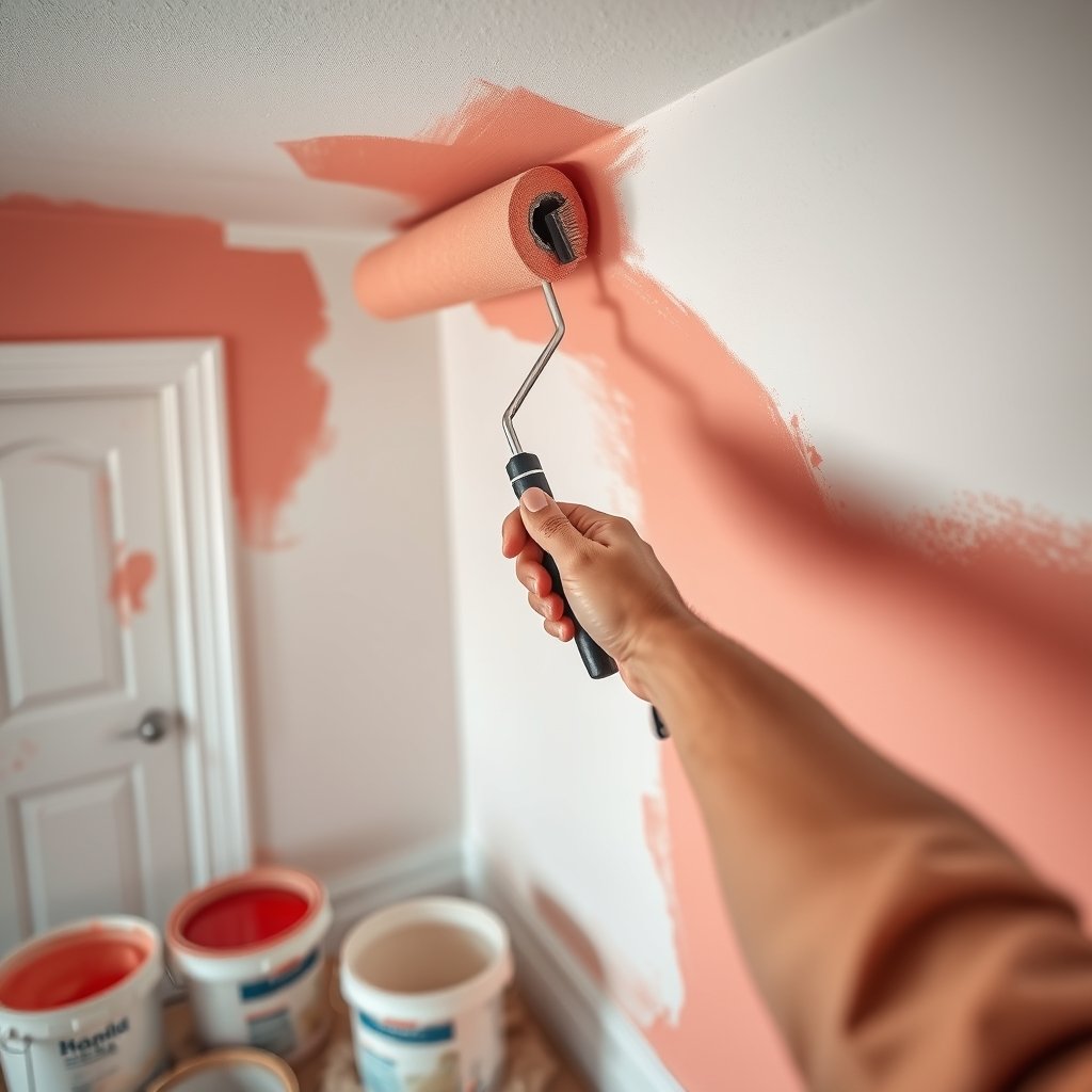
- Trim and door nightmares: Matching paint across different surfaces reveals differences in sheen, absorption, and prep—leading to streaks, odd reflections, or jarring tone shifts when doors and trim don’t match perfectly.
- Color shift shock: Colors look wildly different under various bulbs and daylight hues. Homeowners regret not testing large swatches on multiple surfaces or neglecting how the finish (matte vs semi-gloss) affects glare and shade.
- Resale hesitation: The more dramatic your drenching, the more personal the space becomes—which can complicate future sales if buyers are overwhelmed by deeply saturated or unconventional hues.
These issues are echoed across designer forums and DIY communities. For a deeper breakdown, see the real-life lessons in this firsthand review and check homeowner discussions about mixed results.
| Pitfall | Why It Happens | Simple Solution |
|---|---|---|
| Overwhelming Atmosphere | Color is too dark + weak lighting | Add layered lighting; use lighter monochrome shades |
| Mismatch on Trim/Doors | Different finishes absorb light differently | Test finish combos on all substrates before painting |
| Color Tone Shifts | Poor swatch testing Lighting changes throughout day |
Use poster-sized swatches; Observe at night & day before committing |
| Flat, Lifeless Look | No texture or finish variation | Mix matte and semi-gloss; Add monochrome textiles/furnishings |
| Resale Concerns | Polarizing color choices | Opt for mid-range hues or repaint before listing |
Expert-Level Techniques for a Polished, Livable Look
Designers who specialize in color drenched rooms recommend a few advanced, rarely-shared tricks to solve the most common pain points:
- Mix your finishes for layered depth. Use a matte or eggshell on main walls to absorb glare, but apply a subtle semi-gloss to moldings, doors, or architectural features in the same color. This adds sophistication without breaking the monochromatic envelope and helps the room avoid looking chalky or flat. This method contrasts beautifully with flat painted walls often seen in design magazines. (If you’re also into textured finishes, see our guide on limewash paint for added effect!)
- Try tone-on-tone architectural details. Instead of painting absolutely everything the exact same paint, use one- or two-shade variants for crown molding, window casings, or built-ins. The effect is ultimately cohesive but gently emphasizes the architecture. This is very effective in homes with traditional millwork.
- Add texture-rich accents in the color family. Prevent boredom and visual monotony by layering in varied surfaces—think velvet drapery, boucle ottomans, woven baskets, or metallic fixtures—all in the same general hue. This technique keeps a monochromatic room interesting and cozy, not cold. (Our post on Venetian plaster demonstrates dramatic, color-rich textural effects.)
For inspiration on adding depth with lighting, see our statement chandelier ideas to complement bold monochromatic room ideas, especially in living or dining spaces.
Before You Begin: Testing and Prepping for a Flawless Color Drench Room
Skipping test swatches is the fastest route to color drenching regret. Here’s how seasoned pros ensure amazing results:
- Make large, movable swatches: Paint on foam core or cardboard that you can reposition on every wall, ceiling, and even trim.
- Test outlets, switches, vents: For a high-end, uninterrupted look, paint covers to match or swap with paintable versions. Don’t leave jarring white rectangles as a distraction.
- Check color under all lighting: Review your samples in the morning, at noon, and with evening lamps. Observe how finish choices impact reflection and depth.
- Prep surfaces carefully: Fill nail holes, caulk gaps, and sand glossy baseboards—every imperfection is amplified in a monochrome setting.
According to multiple experts,[1] sample swatch testing is essential, and considering finish and glare before committing will save both money and headaches down the line.
Inspiration Gallery & Pro Tips for Every Room
Ready to see color drenching in real-world settings? Here are ideas to jumpstart your vision:
- Powder room: Small, well-lit spaces can handle deep jewel tones or saturated pastels. Updated fixtures and a matching ceiling maximize the effect.
- Home office or studio: Use energizing blues or greens and match open shelving for an immersive, focus-friendly vibe.
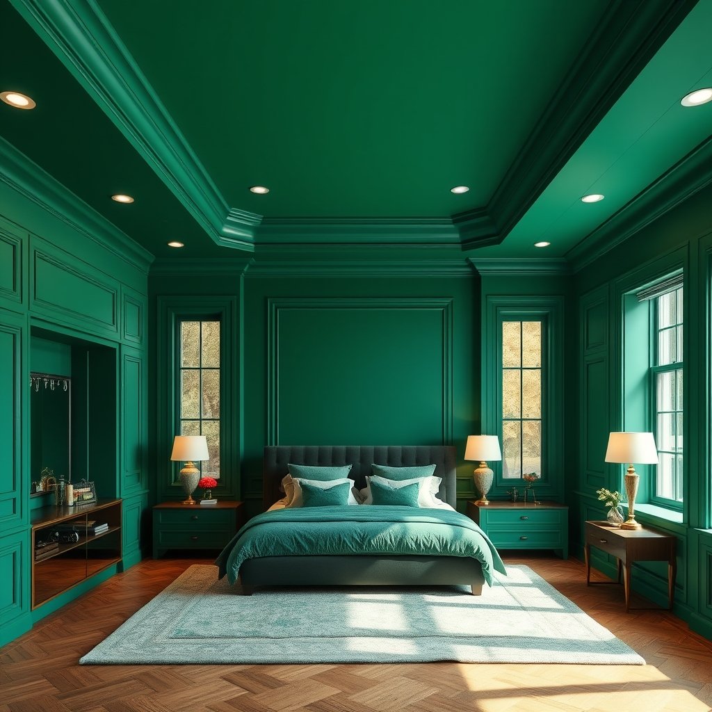
- Bedroom: Choose soft, cocooning hues—think muted sage or rich terracotta—to boost sleep and warmth. Coordinate headboards or dressers to go “all in.”
- Open-plan living: Go for earthy mid-tones with tone-on-tone trim, broken up by texture-rich accents like woven area rugs or heavy drapes. Seek balance to avoid visual overload. For concealed storage in a monochrome look, pair with solutions like invisible kitchens or pocket door cabinets.
Pro tips by room type:
- Start with the least-used room to build confidence. Most designers suggest powder rooms, mudrooms, offices, or kids’ play zones as a low-stakes first project.[8]
- Don’t forget overlooked surfaces—doors, baseboards, built-in shelving, or even the inside of a window bay all contribute to the immersive feel.
- Coordinate with dramatic lighting and minimalist decor for maximum wow factor. See statement chandelier trends for ideas.
- Mix in plush accents or contrasting materials. To keep a monochromatic look from feeling flat, add furniture or hardware in texture-rich variations of your main color. Our limewash and Venetian plaster guides show creative approaches.
FAQs
Does color drenching make a room feel smaller?
It depends on color selection and lighting. Deep or very dark hues can feel cocooning and intimate, especially in small rooms, but adequate lighting or lighter shades can maintain an open feel. It will not physically shrink the space, just alter perception.
Should ceilings and trim always match the wall color?
For a true color drenched effect, yes, ceilings and trim should be in the same color or a one to two shade variant for subtle architectural detail. Mixing wall and trim finishes (like matte walls and semi-gloss trim) adds depth.
What paint finish works best for color drenching?
Most experts choose matte or eggshell for walls to reduce glare and hide imperfections, and semi-gloss for trim and doors. This finish contrast prevents the room from looking flat while keeping the monochrome theme.
How do I test colors before committing?
Paint large, movable swatches on poster board and review them on every wall, ceiling, and trim throughout the day and night. Also, paint outlet covers and small doors to assess the all-over effect.
Is it hard to repaint or reverse color drenching if I don’t like it?
No more difficult than any full-room paint job. However, darker or intense hues sometimes require more coats of primer and a thorough sanding, so factor that into future plans or resale considerations.
Conclusion
Color drenching is a bold expression of your design style, but the details make all the difference. By mixing finishes, layering textures, and testing colors in real lighting, you can sidestep the common regrets and enjoy a vibrant, cohesive look that’s both personal and polished. If you’re tempted to give this trend a try, start small, plan ahead, and don’t forget the power of a little finish-contrast and texture. Transform your space with color drenching—and let us know how your makeover goes!

[…] wellness strategies (such as creating calming home environments), check out practical guides like bold paint trends for stress relief and bathroom wellness […]
[…] for affordable paint upgrades? Explore techniques like limewash paint and color drenching, which offer fresh looks with minimal investment and […]
[…] a bold approach, check out color drenching techniques to create stunning, monochromatic room […]
[…] interior paint: The fastest, most impactful visual lift for the least money. Go bold with color drenching or try trending mineral textures such as […]
[…] Painting rooms in buyer-preferred colors can add value far beyond the can’s price tag. Explore color drenching trends to stand […]